home
home
ABOUT
ABOUT
WORK
work
contact
contact


UX Design Institute
UX/UI Design
Product Design at the University of Dundee was a very user-centred course focused on tackling problems and creating solutions. We studied alongside the class of Digital Interaction Design, meaning a lot of the coursework and projects were similar to what you would expect to see in a UX design project, except the final outcome may be a physical product as opposed to a native app or website.
The digital side of UX Design has fascinated me ever since and in April 2019 I enrolled on the Professional Diploma in UX Design with the UX Design Institute, which is a course accredited by Glasgow Caledonian University. The course consists of 6 months of online learning and projects to be completed in your own time.The learning involves video lectures on UX topics, and the projects revolve around researching and improving flight booking applications.
Worked with: My users - Kirsty, Charlotte, Donald, David & Steven
Tools used: Adobe Xd, Adobe Photoshop, Adobe Illustrator, Pen & Paper, Post-its!
Usability Tests are designed to learn the users goals, behaviours and context while using a native app, website or product. This is done by recording the screen of the product they are using, the user’s face and the user’s voice. By guiding the user through the product, it helps to understand their experience by presenting it from their perspective.These tests with the user at the centre also help to understand any pain points that can be removed or improved, how the product compares to other competitors and how desirable the product is. It’s therefore very important to test early and often.
Before conducting the usability tests I created 4 documents: Recruitment screener, consent form, test objective list & a test script. These documents would have several key uses. Firstly the screener would help me understand the type of user I was looking for and the consent form allows me to use their data and meet GDPR guidelines. Then the objective list and script would help keep a structure to the tests and also define the purpose for testing. For the script to work efficiently, I created two scenarios for the users to follow which I could then compare afterwards.
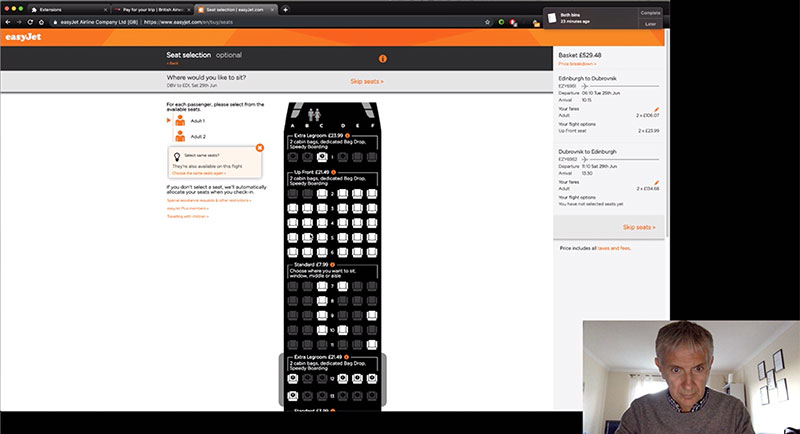
Reviewing all the test data, both BA and EasyJet’s website and app have a similar flow but some varying features. In terms of overall satisfaction of use, EasyJet was a clear winner. BA’s website allowed the users to search for flights that BA don’t offer, while also excluding a section to clearly add extra luggage such as golf clubs. Compare that to EasyJet’s website which won’t display the destination airport if the departure airport doesn’t travel there with an option displaying alternatives to try and keep the user on their site. Comparing the flight website to the respective app, on both occasions the app was a smoother experience although it still had it’s pain points.
Depth interviews gather different data to Usability Tests as they are based on the user’s past experiences with a product. This means that their answers are based on memories of how good or bad a product or service was. In this instance, the questions revolve around the last time they booked a flight or visited an airline website and how the experience was. Depth interviews are also recorded so a consent form and screener are required and again, I created a script and list of objectives. I carried out one depth interview which was filmed.
The depth interview I conducted was useful to better understand a user’s goals and context when booking flights. Finding out whether a phone or desktop computer is normally used to book a flight, or if in fact it’s a combination of both – starting the search on a phone but then relying on the computer to actually process the booking. The specific details about a flight also had an impact on which flight the user would choose – times of departure and landing are just as important as the price of the flight.
Online surveys are a great way of reaching out to a larger audience however the research data can be quite ambiguous. They are normally a very cheap option and pull quantitative and qualitative data. The aim of this project was to create an online survey with no more than 10 questions and bolster the existing research. I devised 8 questions before using SurveyMonkey to finalise the survey.
The results were varied, but fairly consistent and telling of people’s behaviours. In total I had 21 participants.Over 80% of participants had visited an airline website or app in the last month and the majority of those had done so to book a flight. Visiting the website/app, more than 85% of participants were able to complete their task.
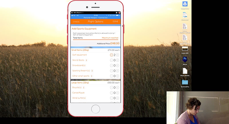
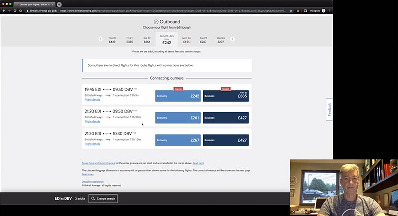
The purpose of carrying out competitive benchmarking is to review other products and determine what features work and what they aren’t doing so well so that your product can be improved. By comparing features of other competitors products side by side, it’s easier to spot what is done well and what isn’t. In this case, screenshots of the products can be annotated alongside commentary on the pros and cons.
I chose 6 airlines and travel companies to analyse and took screenshots of their home page and search page to annotate. My commentary was often similar, with distracting images behind the search box or unclear flow in filling in the search form.
Affinity diagrams are used to start analysing data to pull out points that could be worked on and compile them in a structured format. This works best with more than one person but isn’t necessary. Firstly the team has time to go through all the research and digest it. Then they are all given post-it notes and pens and asked to write one observation per note. This is done for a maximum of an hour and all the post-its are put up on a wall where they can then be grouped naturally. Similar post-its are put next to each other and then a group name is devised to describe them.
For this project I started with post-its and a large whiteboard and then once I had the order and grouping, I translated it onto the computer so that I had a digital version. Writing the observations, I realised there were more faults and pain points than first thought. Each one of the users had negatives about their experience that I could use in the Affinity Diagram. On grouping the post-its, I found that there were many that fitted in a few categories so these were put in the most relevant. There was only one single left at the end which was a positive note.
The customer journey map helps to identify goals, behaviours, context and pain points based on the research you already have. By documenting each step in the process and commenting on the above points, the outcome is a very easy to read document based on the customer’s point of view. The process is simple – mark out the stages in the process at the top of the map with the goals, context etc down the left side. Then for each stage, comment on each of the points based on the existing research and use of the affinity diagram. Once this is done, the top section can be completed with happy or sad faces to describe the satisfaction of the customer’s journey through the product.
The map in general suggests that the whole journey through airline websites and apps is a negative experience. This is in keeping with the research and tests which I felt were all very negative. Creating a customer journey map was a good way of translating research data into a structured document that I can now take into the design stage. Since my usability tests only went as far as the sign-in page, I didn’t want to presume data or create false data so I left the last two columns empty. As with the affinity diagram, I started mapping this out on square paper and moved to the computer to create a digital copy afterwards.
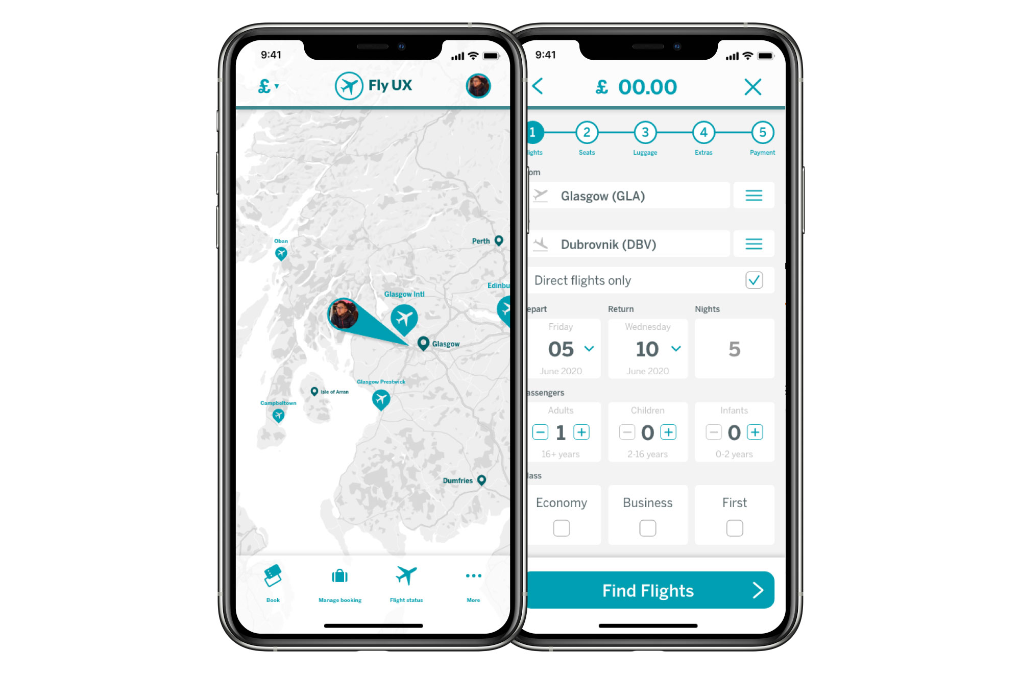
The flow diagram would be the first project that begins the design stage. Creating a flow diagram allowed me to layout the flow of the desktop version of the site using the research I carried out and address all the issues that were highlighted in the customer journey map. This would prepare me for designing the screens which would come next. The diagram has to be easy to read and as the name suggests, flow. I created it in Adobe Illustrator and used the pink in my own branding.
Creating the flow diagram took longer than I had expected to carefully think through the order and use the research to back this up. However, I am pleased with the outcome and feel this order fits the flight booking system than most websites out there at the moment. It was also interesting to see that most of the actions occur on the homepage selecting and entering the details of the flights. The rest of the process is relatively quick after that. The next step is to marry the design with the flow to create something slick and easy to use.
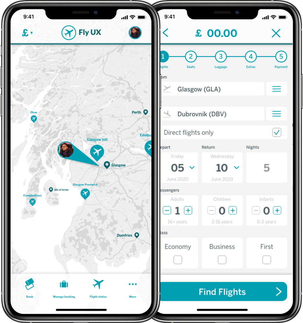
Creating a flow diagram for mobile was a similar task to the desktop version so I used that as a basis for this one. There are differences between a desktop app and a mobile app, hence why I did this project twice. Differences can include how many pages there are and what actions take place where. Second to that, navigation is different on a mobile compared with desktop applications so designing a system or flow that will work on each can be very different.
This flow diagram took less time to create as I had the desktop version as a starting point. Working out the flow was interesting to see how the number of pages differed due to the smaller screen. There are more states in this flow diagram which is again due to the size of the buttons and how much information can be read on a phone. One of the biggest differences was that the outbound flight details and return flight details spread across two pages on mobile but one on desktop. The next step is to define the navigation for the app and how the flow works on a mobile device.
Defining navigation is a crucial stage in the design process of an application or website – it determines how users will move from page to page. There are different nav styles to choose from but not all are appropriate for the type of application or website you are creating and it also depends how much information you have to navigate. The objective here was to choose a nav style and sketch out how it would look to test whether or not it would work for a flight application.


After some deliberation I chose to use a global header navigation bar. That way wherever the user is in the application, they have access to the home page, a section to manage their booking and their profile. Visually I think this will be appealing while staying functional. During the booking process, the content effectively becomes the navigation. As the user selects information relating to the booking, confirmation buttons become clickable and lead them to the next step in the booking process.
Like the flow diagram projects, this navigation project was the same brief but for mobile as opposed to desktop. The method would be the same but the information and decision making would be different. Firstly, I needed to define the application type. There are 4 types: Utility, Process, Consumption and Commerce. Since booking a flight is a complex and structured task I chose Process as the type. It fits with the multi-level tasks that a user would perform on a flight booking application


Navigation on a mobile device becomes slightly more challenging than on a desktop as there is much less screen real estate to accommodate the same amount of information. Good mobile navigation is critical to good user experience. I decided that the main home page would have a tab navigation at the bottom of the screen closest to the user’s thumb for easier access. Then for the process of booking a flight, the navigation would effectively be a mode or microtask style task. The main nav tab would disappear giving more screen for the booking of the flight.
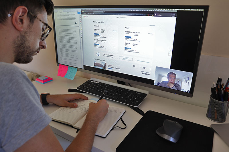
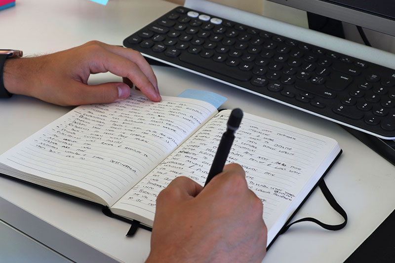
This project brings together all the work I have done so far to create the screens and screen states for the desktop version of the application. The task is to sketch each screen that the user would see and iterate until I am happy with how it looks and how it flows. I used a squared paper book to allow me to draw more accurate lines and to be able to recreate the shapes more easily. These will be developed into high fidelity wireframes and prototypes but this is a key stage to nailing the design as soon as possible.
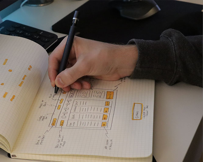
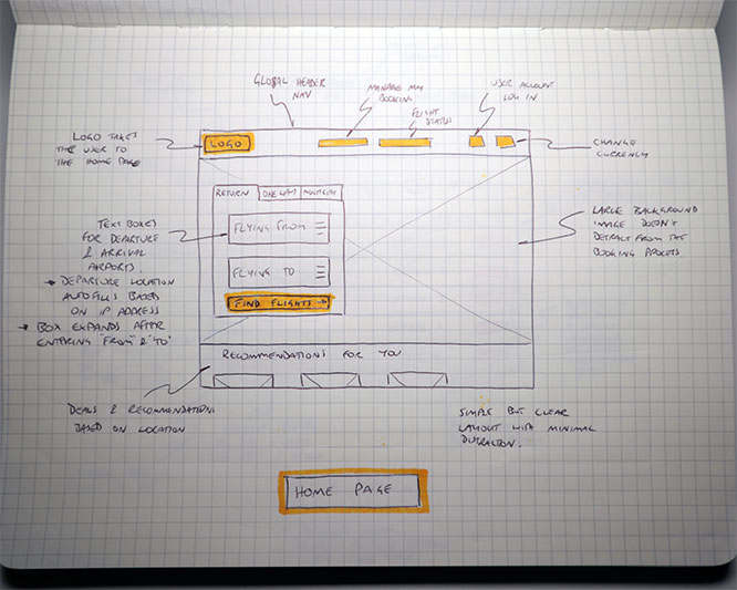
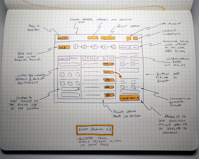
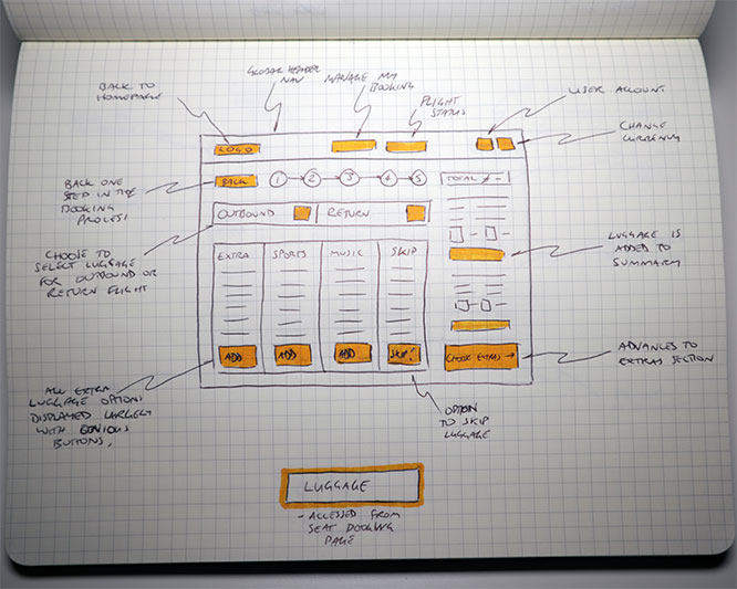
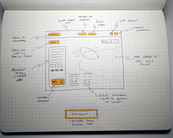
This was challenging bringing in all the research and outcomes that I had already to create the screens that would be the basis of my application. I relied heavily on the flow diagram for the order and flow of screens and recalled the research I did a few months ago to make sure I was addressing the issues that arose. Sketching the screens was invaluable as I was able to draw a screen quickly and work out whether it would work or not and then make any changes if necessary.
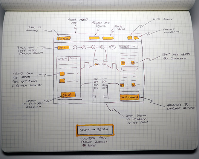
This project was again very similar to the one for desktop – sketch the screens that form the basis of the mobile application. The main differences would be the different styles of navigation that I chose in the previous project and the size of the screen. Placement of icons or buttons would need to be designed differently and size of content rethought. I used the same squared paper book for accuracy and to ensure I could replicate the size of screen while sketching.
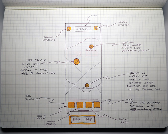

I had different ideas for some of the interactions with the mobile app. For example the home page I wanted to have a map that showed airports local to the user as a starting point for their flight booking process. It took a few attempts to get the navigation right even with the work done in the last project as refinements needed to be made to some of the positioning of buttons. Overall the content was largely the same but size and location was different.
This penultimate project involved pulling all the data and research I had gathered over the last 5 months to create a working prototype. I decided to create a high-fidelity prototype – logos, colour and interactions all thought out and designed. I created a logo and devised a colour scheme which formed the basis of the design. Using the screen designs I created in the last project, I had a starting point for the layout.
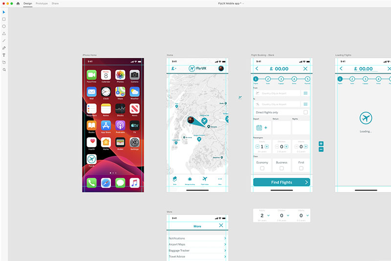
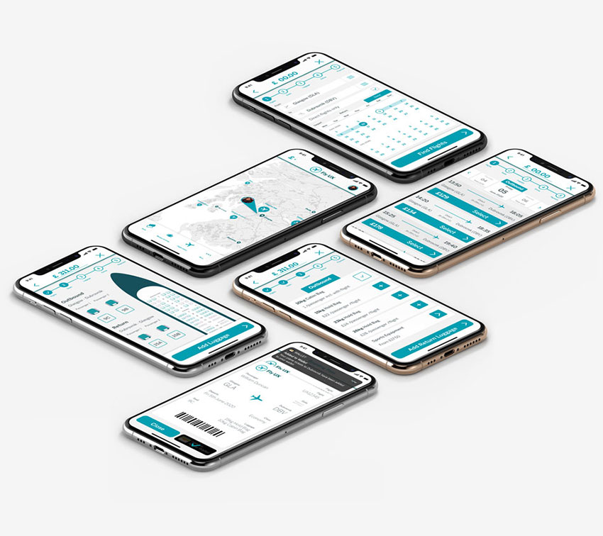
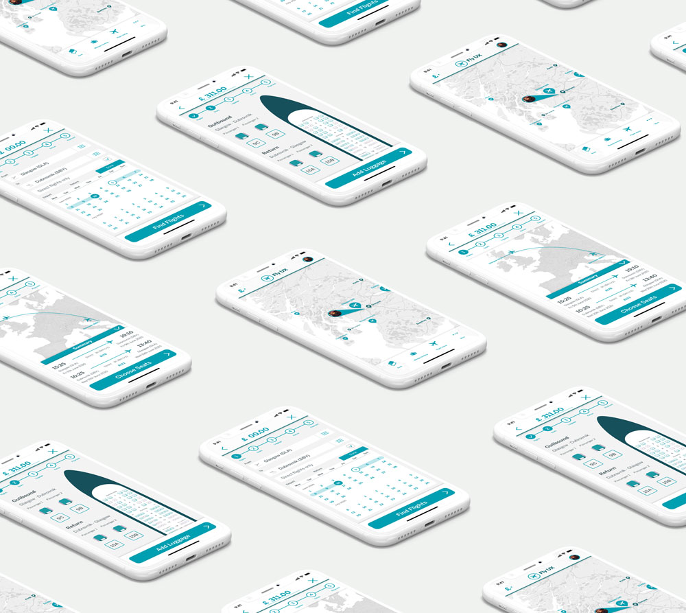
I created the app in Adobe Xd with a working prototype. Overall it was a very rewarding process designing and using all the research I had gathered and improving on the benchmark apps I tested.
Update:
Looking back on this project a few years after completion, there are many things I would change having developed my skills in UX, though I am proud of what I completed at the time. The font could be more trustworthy - sharper corners and less playful for a flight app. The use of similar colours means the app looks very monochrome, it could do with some varying colours to make it pop.
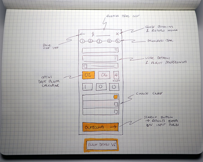
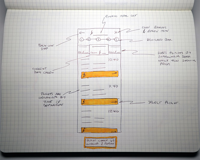
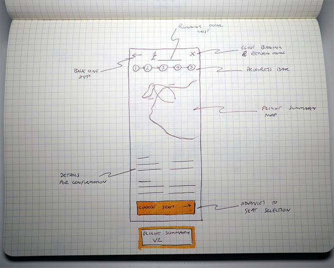
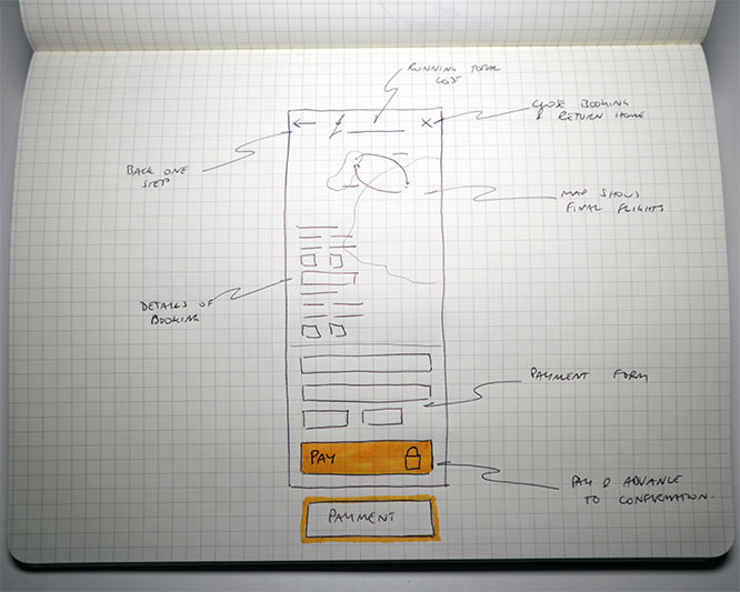
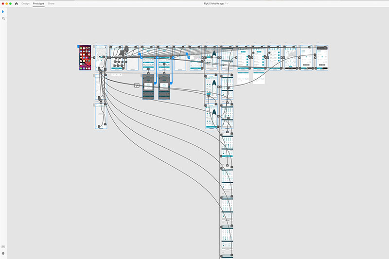
Creating wireframes was a very detailed project. It required annotating every screen and screen state for developers as if they were going to build the app. This meant annotating every button state, every ‘if’ clause and what happens on selection. I used Adobe Illustrator to layout each screen state and annotate with orange boxes.
Possibly one of the most important projects, the information that goes into creating wireframes has to be accurate, detailed and precise. Developers need to know exactly how it has been designed and how to therefore build the content. This is very similar to creating a production/manufacture drawing for a physical 3D product in that the engineers and craftsman need to have detailed drawings of each component to be able to again build a prototype. The similarities and crossover is very interesting and it was fairly easy to get granular and detailed with the information.


